
Let’s explore some examples of cropping. I’m not great at it, but here are some attempts of mine to use cropping to improve composition. They aren’t necessarily successful attempts, but I’ll at least explain my thinking behind each attempt.
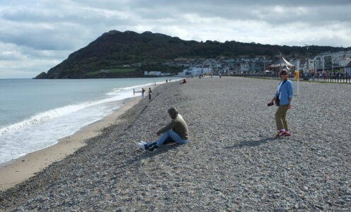
Beach at Bray
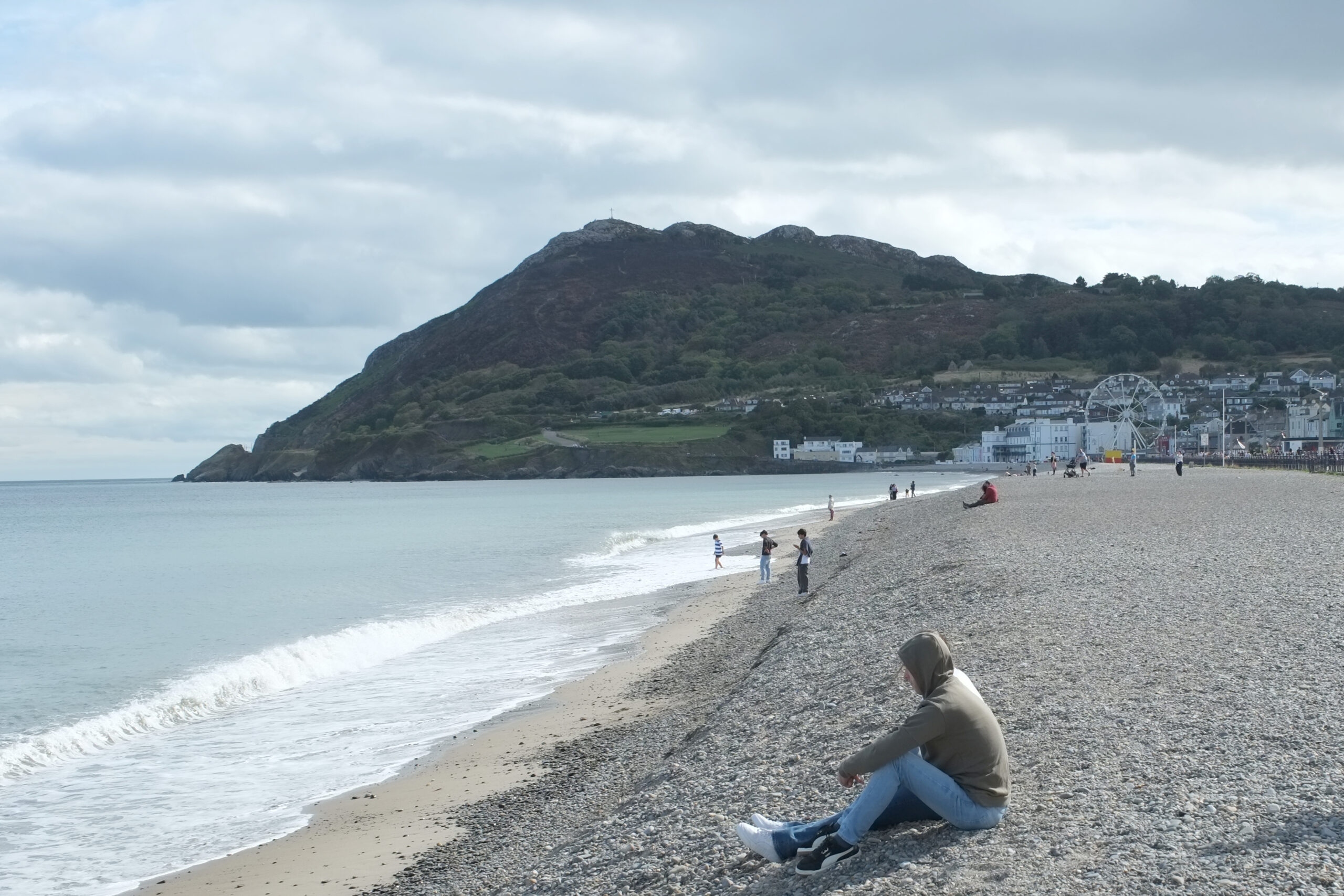
Here we have the beach in Bray. In the original photo, I was hoping to capture the beach with Bray’s Head in the background. As always, the majesty was not captured. However, there’s some usable material here. My first thoughts are:
- Bray’s Head is too dark
- Jessica is too far right, not enough in focus
- Some rando is taking up too much space in the foreground
- Is the focus the beach? Or the people? or Bray’s Head? It’s not clear
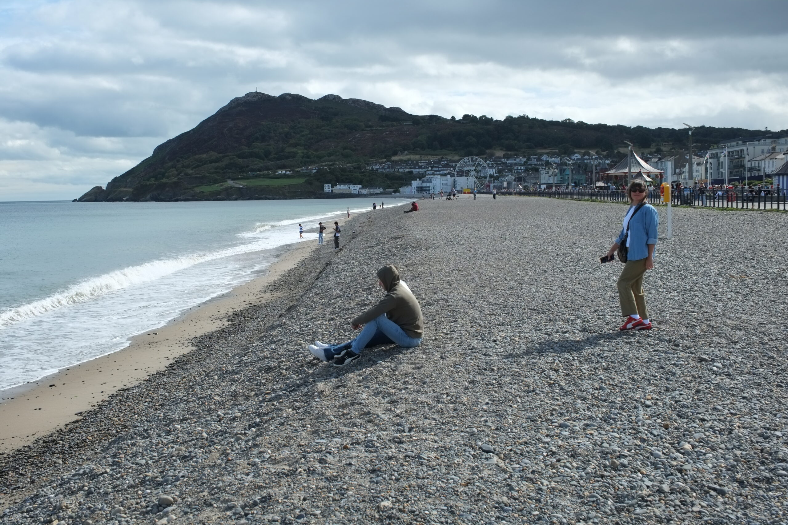
In the first attempt, I crop it so that Jessica falls on the right third line. This brings her into focus, while kindof highlighting the fun of the beach and boardwalk behind her. The composition still seems bad to me. The horizontal line of the boardwalk intersects with Jessica’s head, kindof distracting from her as the focus of the image. Still more focused than the original though.
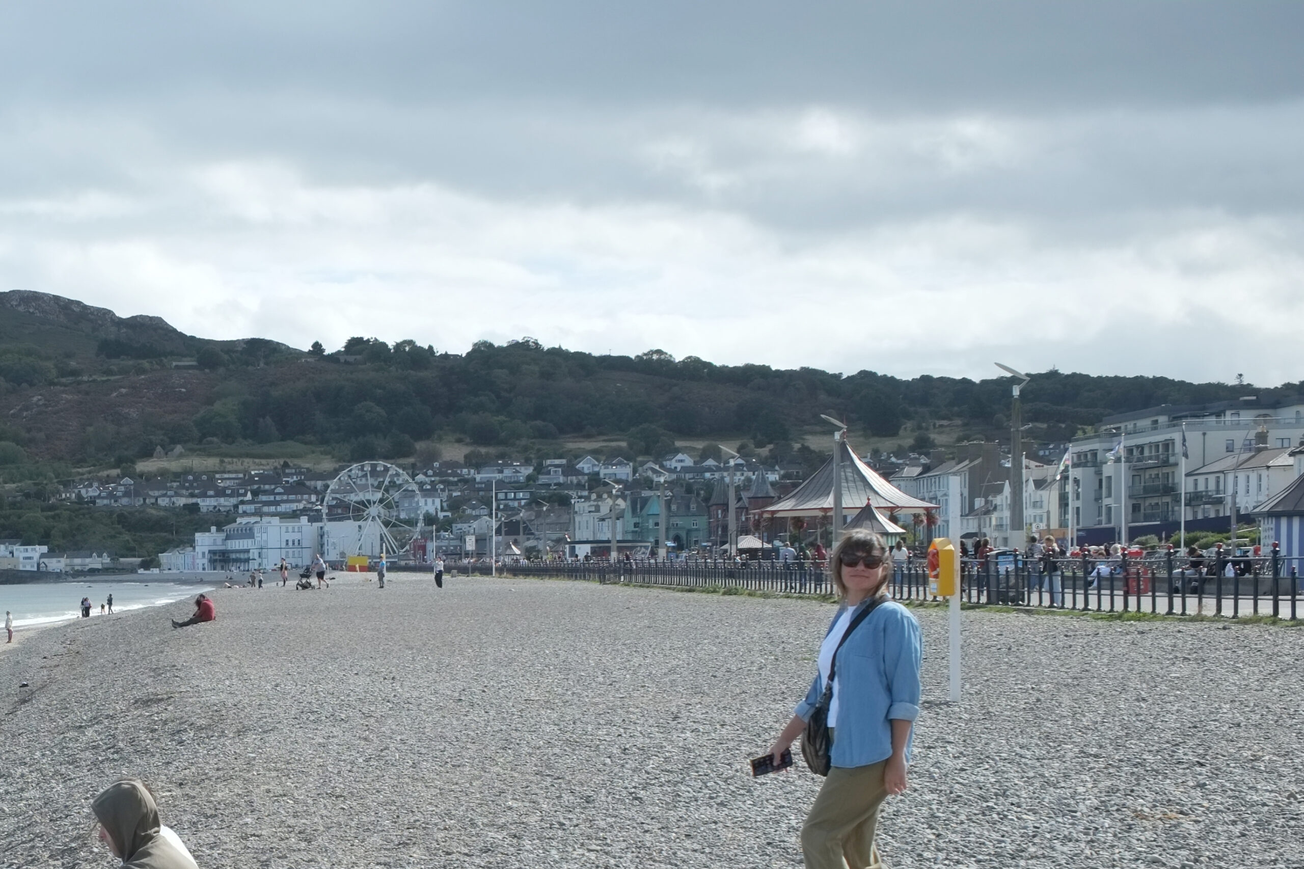
My thinking behind the following crop was to lean into making the rando in the foreground as the focus. By moving the rando into the foreground, there is something grounding the photo, and then Bray’s Head in the background serves as a looming spectacle where your eyes eventually wander. I like the composition of this crop much better.
Hibernia
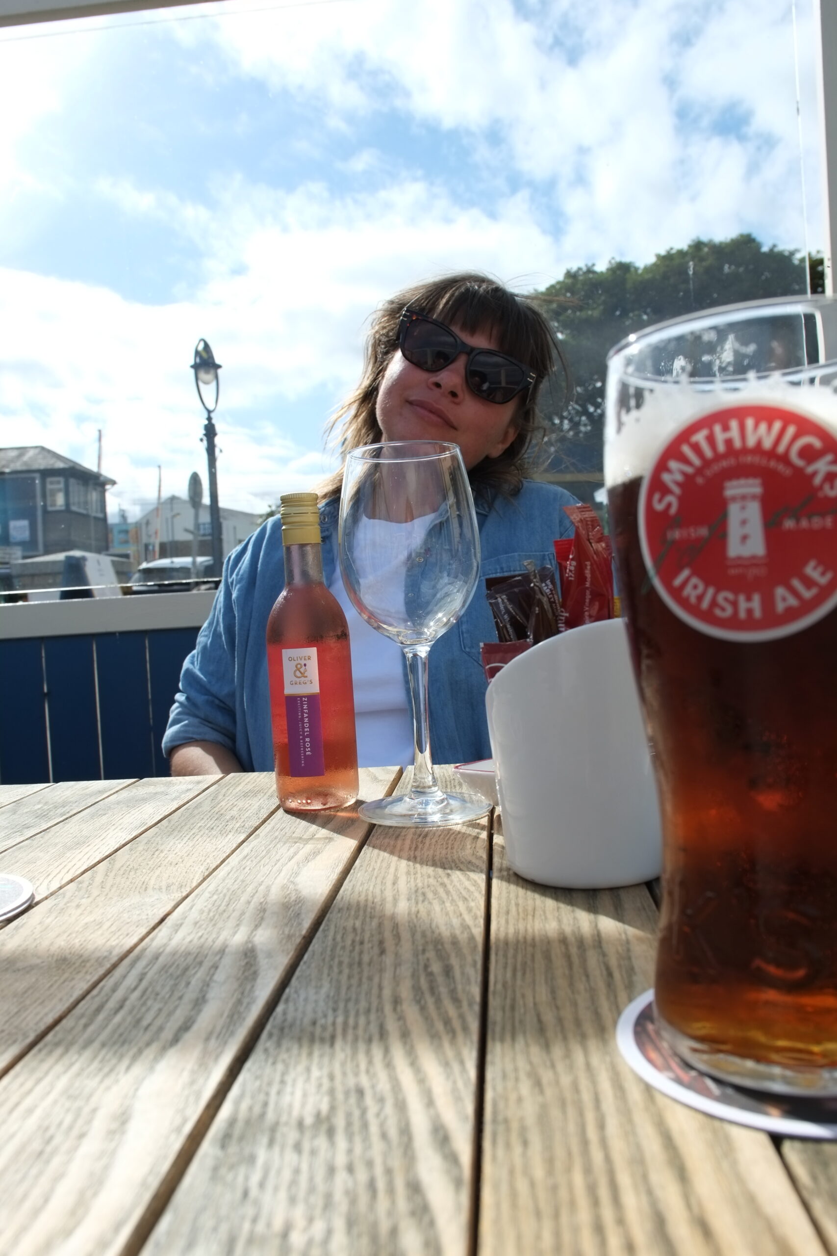
During our day in Bray we got lunch at a delightful little spot called Hibernia (Roman / Latin for Ireland). I got fish and chips. Jessica got mussels. It was delicious and charming. Here we have a portrait oriented shot of Jessica. I like the shot, but immediately, I’m thinking that the table is taking up a lot of the shot. The leading lines are pointing to Jessica, which is good. But it still seems to be taking up a lot of space, pointlessly.
A final thought about this shot: I do enjoy the idea of using cropping to get multiple usable photos out of a single shot. This idea might be worth keeping in the back pocket for any shot which, at first, seems unusable.
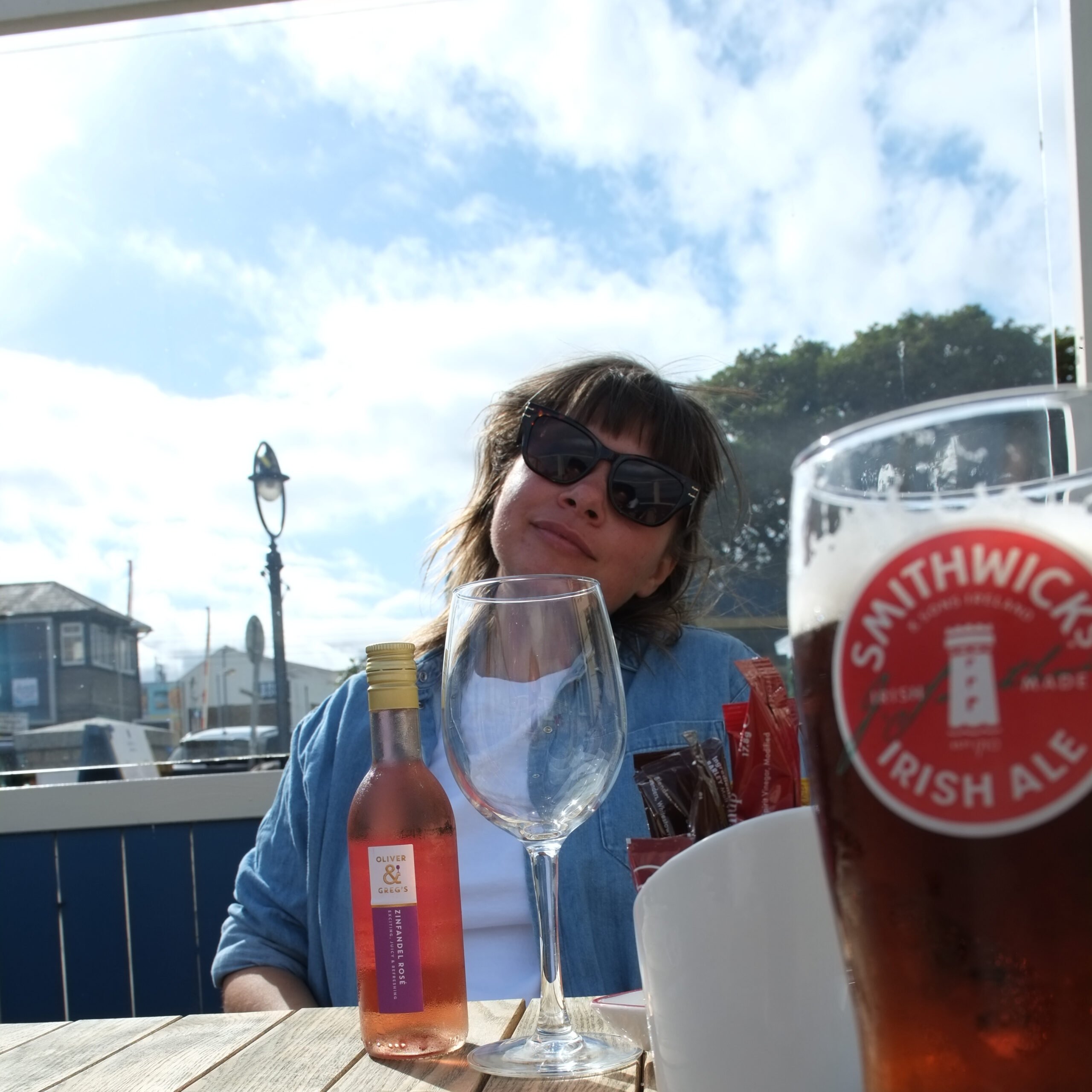
My attempt at fixing it was to crop with a 1:1 ratio, making it more social-media ready. This puts Jessica squarely in the center. There doesn’t seem to be any clear compositional elements other than Jessica being featured in the center. So ultimately, I’m not sure which version I like better. It might also just be a bad shot.
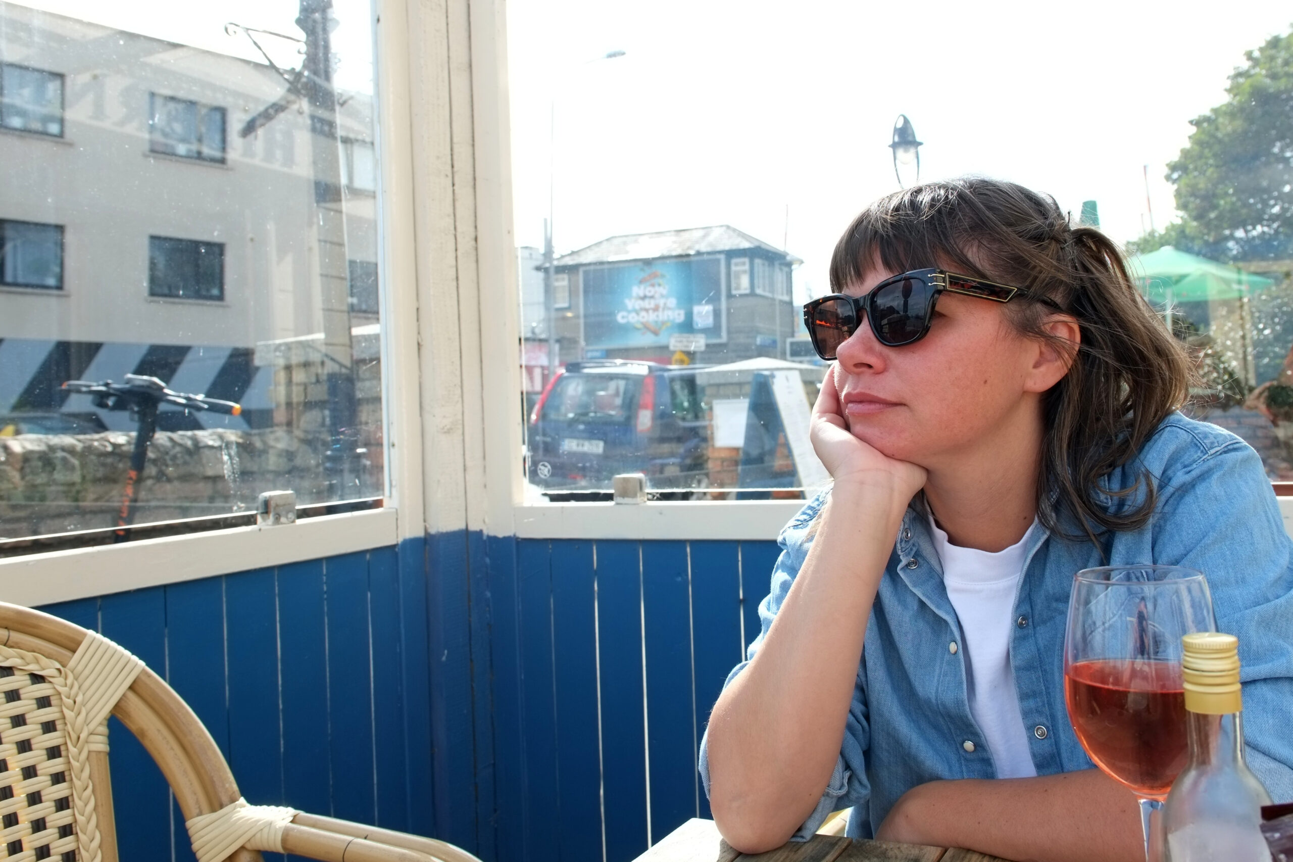
Another Hibernia
Here’s another shot at Hibernia. I like the shot. But notice the reflection of me in the glass to the right of Jessica.
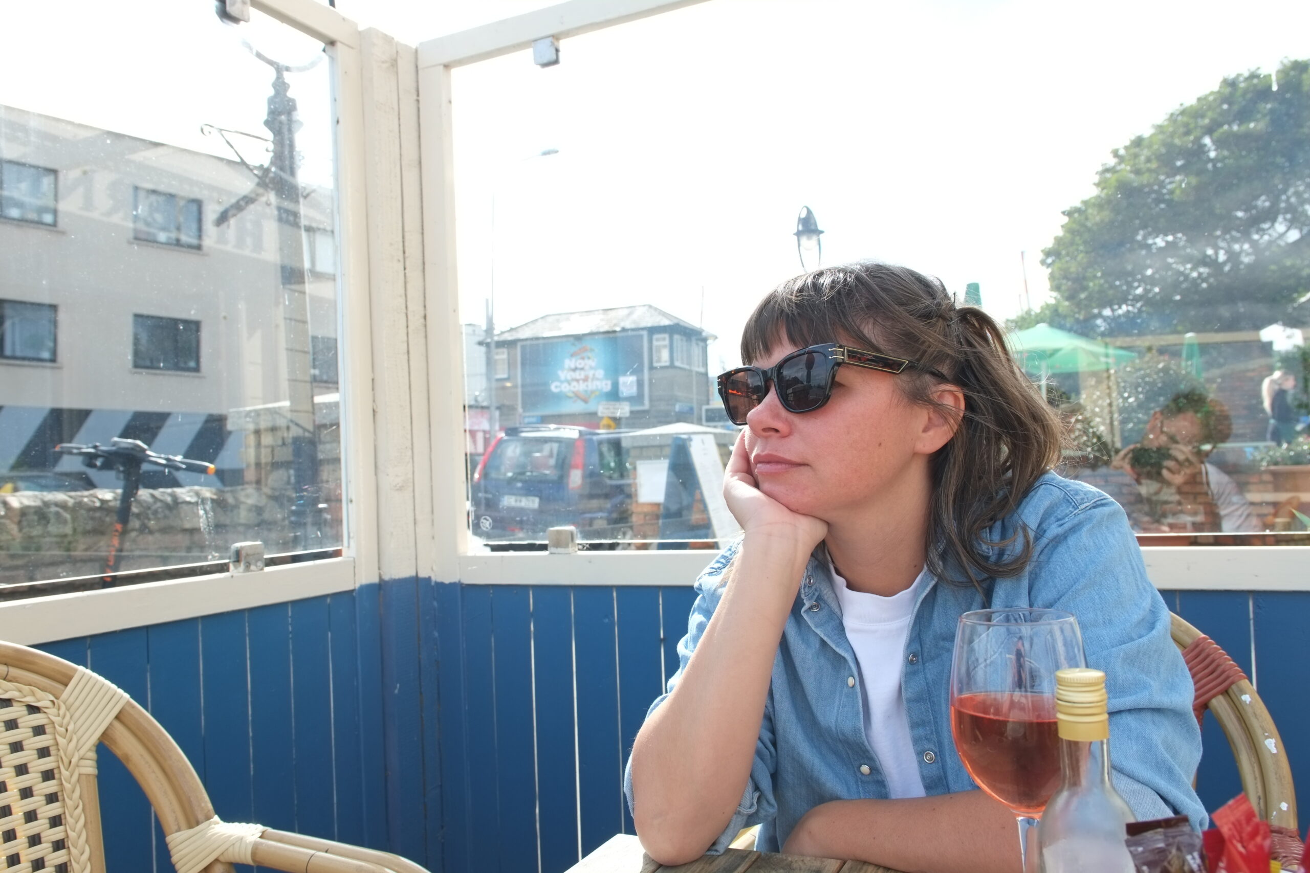
Here, I crop just enough of me out of the photo so that you can’t really tell what it is. I also adjusted the colors a bit. I like the crop much better.
Bray’s Head
Finally, we have a shot from the top of Bray’s Head. I basically like the original shot. But I don’t like how much of the photo is occupied by the gravel in the foreground. I would prefer to have the landscape in the background be more the focus of the shot.
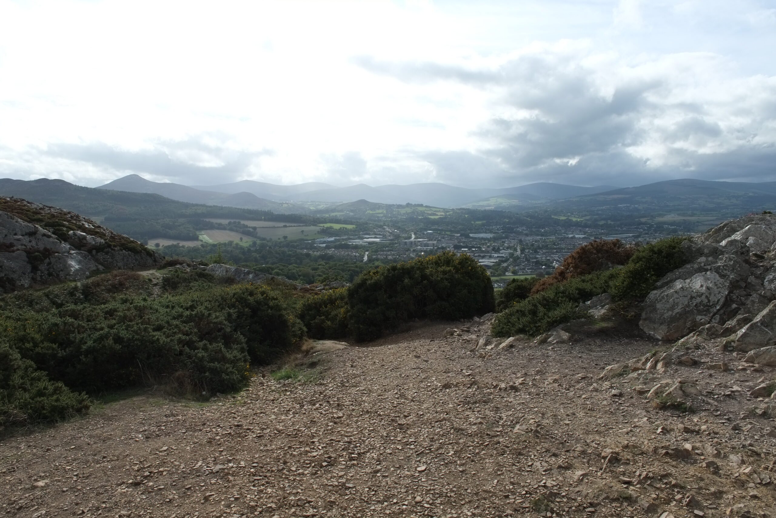
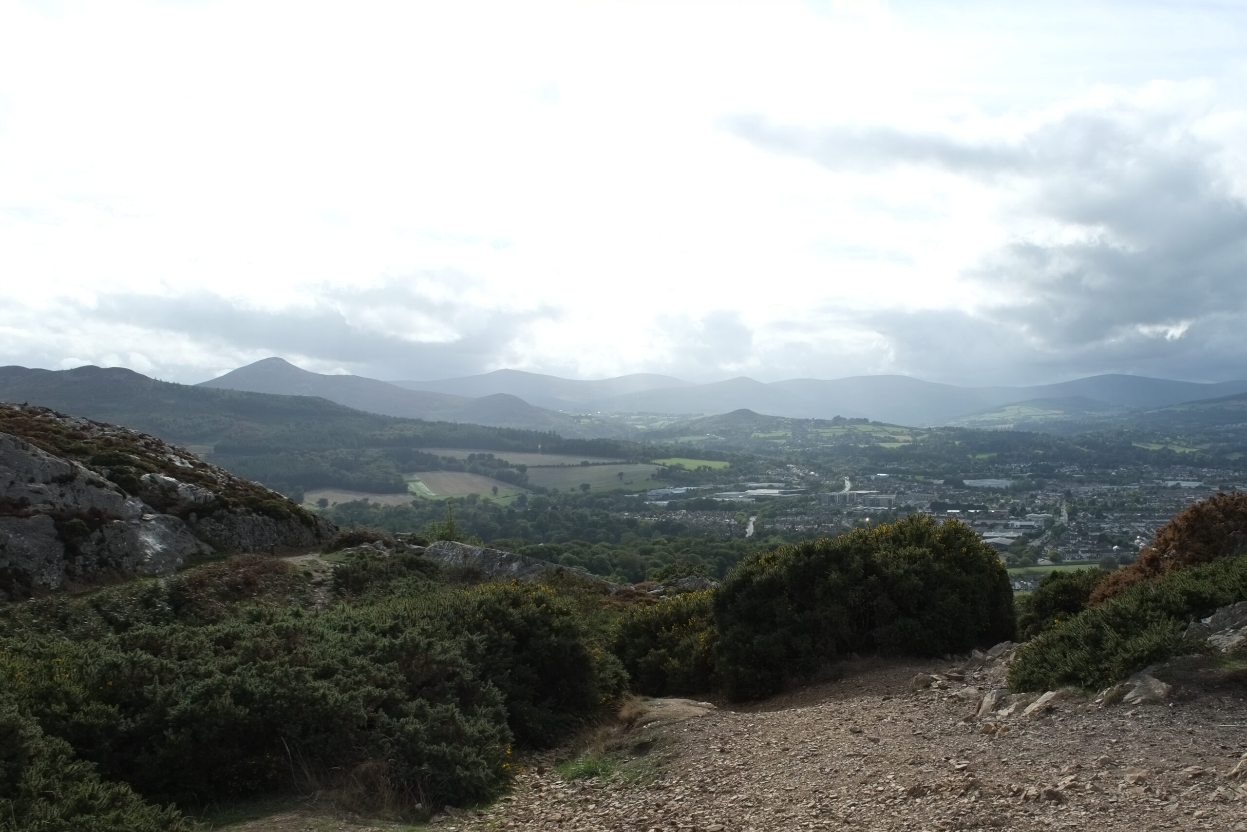
Here, I crop most of the gravel out. In terms of composition, I like the swooping lines in the foreground and their interplay with the swooping lines of the mountains in the background. Also, instead of dominating the foreground, the gravel and large stones in the foreground give me the sense of sitting in a perch above the landscape below.