A couple of weeks ago I decided to forego my routine upgrade to the latest Ubuntu in favor of checking in on another of my go-to Linux distros: Fedora. I typically find Fedora to be a breath of fresh air after months of being stuck in the Ubuntu rut. How did it hold up this time in terms of usability and overall polish? Read on…
My time with Fedora 19
Upon first booting up Fedora, I was greeted with the beautiful Gnome 3 desktop. Compared to the Unity desktop on Ubuntu, this was definitely a refreshing change and with only a few minor tweaks to the settings I basically comfortable with my shiny new desktop. After installing Vagrant, VirtualBox and Sublime, I was working within the hour. For me, that’s a pretty impressive turnaround. After spending about a week working with this setup, I did notice a number of things on which to commend the Fedora team, as well as some points that could use improvement.
Pros
- Very elegant installer. There really wasn’t much to it and the installation went very quickly
- Slick intro video and Help. Upon installing Fedora for the first time, you are greeted with a slick help video from the Gnome 3 team. It looks really pro and adds a nice level of polish. New user of this OS are sure to benefit from it. Normally I skip these sort of things, but this time I actually watched a couple of minutes of it. Not bad.
- Generally very lightweight and responsive. One of the things I was hoping to experience with Fedora was a less sluggish interface than my Unity 7 interface on Ubuntu. For the most part the Gnome 3 interface delivered that, once I got used to snapping my mouse to the top left to reveal overview mode.
- Aesthetically Beautiful. I realize this point is much more subjective than the others. Also, much of the aesthetic beauty does come from Gnome 3, which, of course, I could install on Ubuntu if I really wanted to.
- Notifications and Chat. This could probably fall under the previous point. But one thing I do consistently love about Gnome 3 is the notification system. The notifications are pretty and useful. I love also how well integrated they are with Empathy. I even had my Skype messaging routed through Empathy via skype-purple for exactly this reason and it was wonderful!
Cons
- Multiple Monitors. The support for multiple displays in Gnome 3 is almost perfect. But you do have to tweak the gconf settings to get them to work the way everyone wants them to work by default.
- No Compiz style keybindings. Add this to the list of very subjective complaints. Using Unity, I’ve gotten extremely accustomed to using the thumb button on my Logitech m705 mouse to toggle “scale mode” in Compiz / Unity. I assumed it would be a simple matter of setting that same keybinding somewhere in Gnome 3 to toggle “overview mode”. I was wrong. The most popular method of accomplishing this, as of writing this article, appears to be installing xkeybind and xdotool and setting up the keybinding that way. So… not fun. It’s also out of the question for a typical computer user.
- Software Installation. Installing software on Fedora is not very difficult. Unfortunately, neither is it as effortless as software installation on Ubuntu.
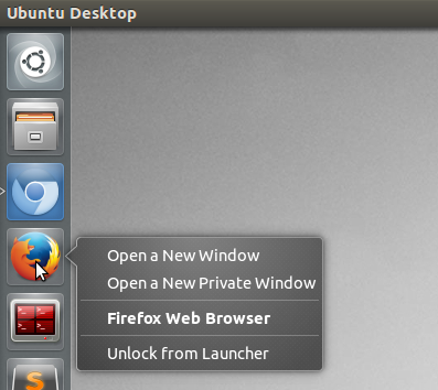
- Launcher Menus. During my workflow, it has become routine for me to open and close many temporary sessions of both Firefox and Chrome throughout a typical day, using “Incognito Mode” or “Private Mode” depending on the browser. With Ubuntu, this is a quick and simple process, thanks to the launcher menus:

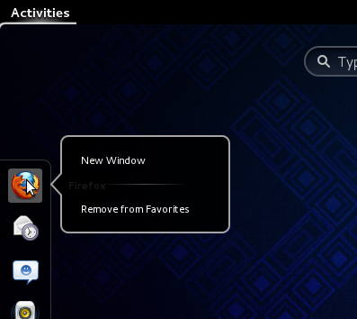
On Fedora (read: Gnome 3), you have to open the application and create a new private window from there, like an animal:

This may not seem like a big deal, but any time you find your precious workflow interrupted by a snag like opening a new window, little issues tend to become frustrating irritations.
- Popularity. Unfortunately I found that much of the desktop specific software I installed was built for, and tested on, Ubuntu first, making other distros like Fedora an afterthought. One example that comes to mind is support for my loathed NVidia graphics card with Optimus. On Fedora, I was able to find and install Bumblebee, but it never quite worked as well as I was used to.
After it was all said and done, I did genuinely enjoy my time with Fedora. And I still have it installed on another partition, just in case. But in the end I knew I had to make things right with my old standy-by…
Back to good ol’ Ubuntu
Say what you will about Mark Shuttleworth’s sometimes uncomfortable design decisions, he’s definitely stuck with them (well… most of them). The payoff for this consistency has been a solid, usable deskop. I know Unity gets a lot of flak for being different and bold (and ugly, as some will claim), but in my experience, once you familiarize yourself with it, Unity delivers an intuitive, fluid experience that really does not get in your way. As with Fedora, the installation went fairly quick and in under an hour’s time, I was busy working with my old familiar setup. After a week on another desktop, I did notice both some Pros and some Cons on my return to Ubuntu.
Pros
- Customizability. One of the first things I enjoyed about coming back to the familiar Unity desktop was the customizability. After installing the CompizConfig Settings Manager, it was a simple matter of a few clicks to get my desktop just the way I like it.
- Software installation. As I mentioned before, installing software is not a difficult process on either Fedora or Ubuntu. In my opinion, though, it is much easier on Ubuntu. This is thanks, in part, to their software center (which is in need of an update) and Synaptic, the most popular front-end to their Aptitude package manager.
- Launcher Menus. The launcher menus on Unity are very useful. (See the corresponding Con for Fedora / Gnome 3.)
- Media Codecs. Installing the media codecs is pretty darn easy in Ubuntu. They don’t all come installed by default, but they’re not exactly difficult to find.
Cons
- Smart Scopes. This is the part where I join in the chorus of Unity-haters. The smart scopes might make business sense for Canonical. For me, though, I don’t see myself ever using them. Fortunately it is very simple to disable them. Better to have my laptop using its precious resources on doing what I want it to do quickly and not looking up keywords in Amazon’s database.
- Slightly sluggish interface. The interface on Unity does tend to be fairly snappy after I first start it up but before I have too many windows open. Once I get too many windows open and my workflow is under way, I notice the Unity dash and the Alt+Tab switcher have a half-second or more of lag, which does tend to get on my nerves. Luckily, I’ve found it can be fixed by turning off the blurring in the Compiz Unity plugin settings. Also, I should mention that running Unity with my NVidia graphics card is a delight. I usually have it turned off, though, in favor of my built-in Intel graphics.
- Slow top panel. Aside from the overall sluggishness my desktop sometimes experiences when running Unity, there is another related issue that is a constant source of irritation to me. In this latest version of Ubuntu, on my system, the top panel, including the notification tray and the menu application, is often extremely slow. Many times I will click on something and it won’t even render. Since this does seem to me to be a glaring problem, I would hope Canonical will resolve this soon. As of now, though, the best advice online seems to be to disable menu animations in the Compiz Unity plugin.
Who wins the showdown?
In this showdown, Ubuntu won me over. I should say it won me back. I will admit, however, that I may not have switched back if it weren’t for my demanding standards for workflow. There are some interface issues with Gnome 3 that I genuinely feel will hinder productivity for anyone trying to get serious work done. There are other issues that I readily acknowledge are caused solely by my adherence to my own crazy way of interacting with my computer.
Aside from the workflow issues there doesn’t seem to be a clear winner to me. Both desktops look very nice, although I prefer the look and feel of Gnome 3. Both desktops have strong community support, but Ubuntu has more. Most importantly, both of them will enable you to quickly and easily post cat videos to Facebook while listening to your favorite Miley Cirus album. I mean come on. Let’s not pretend we use our other workspaces for more work.
